RAW or TIFF in CaptureOne for Film Simulation
Using Our ICC Profiles on RAW Files in Capture One — What to Expect and What to Do If you’ve…

If you’ve ever asked me for “the recipe,” you’re not alone — it’s probably the most common question I get. And honestly, it’s a fair one. The truth is, there isn’t a single recipe. There’s a process, and it’s one we’re still learning from and refining with every new simulation we release. I thought it was worth walking through it openly, because understanding what goes into these might also change the way you use them — whether you’re someone who just wants a great look straight out of the gate, or someone who spends hours dialing in every detail.
There are three phases to how every ANDP FilmStyle gets made.
Before anything creative happens, there’s a lot of reading. Film data sheets, clinical laboratory descriptions of how specific emulsions render color — dry material, but necessary. This is where we try to understand, as accurately as we can, what a given film stock actually does to color. How it shifts reds, where it pushes greens, what happens in the shadows versus the highlights.
All of that gets collected and synthesized into what we call the ground truth — the first reference point that every decision in the simulation has to answer to. It’s not glamorous work, but it’s what keeps everything grounded.
Part of this is also understanding the full physical chain of the film. Slide film, negative film, and print film all behave differently — and negative and print films have an extra step: the paper. The paper adds its own color character to the final image, and that matters. Tools like spectral_film_lut and spektrafilm do impressive work simulating not just the emulsion but the paper behavior too, and we use them as a cross-reference. One thing they make very clear: strip the paper out of the equation, and most film stocks look far more similar to each other than anyone expects. The differences we love are often as much about the paper as the film itself.
The ground truth isn’t the final simulation. It’s just the foundation — the thing that keeps us honest when the creative decisions start piling up.
This is the part of the process that’s harder to explain, and probably the most important.
Once there’s a ground truth to work from, we start collecting real-world references — actual images shot on the film stock, hand-picked from photographers whose work we trust and whose use of that specific film can be verified. Those references get measured and compared twice: once against digital reality, and once against the ground truth. Then the process repeats, the sample grows, and gradually a clearer picture emerges of what the simulation should actually feel like.
But this is also where staying too close to the lab data can work against you. A purely clinical result can be technically accurate and still feel like nothing anyone has ever actually seen. Fujifilm probably has more precise data on their own film stocks than anyone on earth — and yet the community consistently gravitates toward the community-made “recipes” over the built-in clinical simulations. That’s not a knock on Fujifilm. It just points to something real about what people are actually looking for.
So the honest question we have to ask is: where does the inspiration live? In what researchers measured in a lab, or in what hundreds of millions of people actually saw, printed, and kept?
For Kodachrome, that meant absorbing the science and then spending a long time with McCurry’s work — understanding how he was pulling those reds, where the yellows were landing. For Ektachrome, it was Eggleston and a handful of others. Photographers who used these films with real intention, producing images that have stayed with people. That’s the aesthetic layer that sits on top of the lab data, and finding the balance between the two is more of an ongoing conversation than a solved problem.
That said, not every verified example is worth chasing either. A poorly scanned Kodachrome on a 1998 home flatbed with no color correction is technically Kodachrome — but it’s not what anyone is looking for when they reach for a Kodachrome simulation. Judgment calls are unavoidable, and we try to make them carefully.
Back in 2020, this phase meant Photoshop, an eyedropper tool, and a lot of patience — manually sampling swatches from dozens of references and matching them against the lab data. Slow, but it worked, and that’s the foundation most of the current FilmStyles were built on.
More recently, we’ve had the help of Khroma, an internal tool developed in-house by our team — myself as lead colorist alongside the two software developers who recently joined as co-founders. It can take any image, read its color shifts, and generate a LUT that replicates that grade. It’s made the reference analysis side of things considerably more precise. It’s also nowhere near ready to put in front of users — it’s a tool built for a very specific workflow, and it’ll stay internal until, if ever, that changes.
By the end of Phase 2, there’s accumulated .cube data that’s been built up and refined across a wide reference set. Phase 3 is about finding where it breaks.
The grade gets run against a series of specifically chosen test images — content designed to push a LUT into uncomfortable territory. Extreme skin tones, tricky mixed lighting, heavily saturated subjects, difficult gradients. The kind of material that reveals clipping, banding, hue rotation problems, or color shifts that only show up under pressure.
This matters as much for everyday usability as it does for technical correctness. A simulation that looks great on a golden hour landscape but falls apart on a portrait under fluorescent light isn’t ready. The goal is something that a casual shooter can drop onto a vacation photo and have it just work, and that a professional colorist can take into a complex grade without it creating new problems to solve.
If a simulation comes through the stress tests clean, it’s ready. Not “good enough” — actually ready. I’ll hold on to it for a while, take my camera, shoot a set for it, render it. And then I start to pack it.
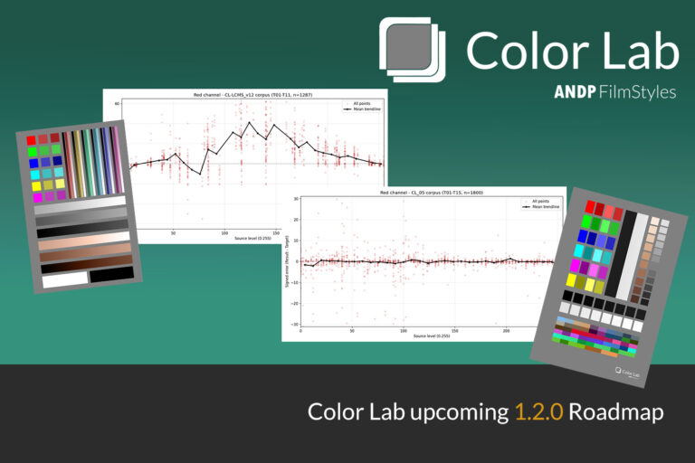
This is also where Color Lab fits into the picture — a LUT-to-ICC profile converter we’ve been developing in-house, due to launch as commercial software this month or next. It opens up how these grades can be deployed across CaptureOne’s workflow that relies on ICC-based color management, which is a meaningful step forward for professional users in particular.
It’s lab data, real photographer references, and a process that tries to hold both of those things in balance — without pretending that balance is ever perfectly achieved.
These simulations are built to be usable. A casual photographer should be able to apply one and feel something right away. A seasoned colorist should be able to take it further without hitting a wall. Whether you land somewhere in between, that’s really what we’re working toward with every FilmStyle we release.
Using Our ICC Profiles on RAW Files in Capture One — What to Expect and What to Do If you’ve…
It has been almost 10 days since Color Lab released and the experience has been a truly amazing one. First,…