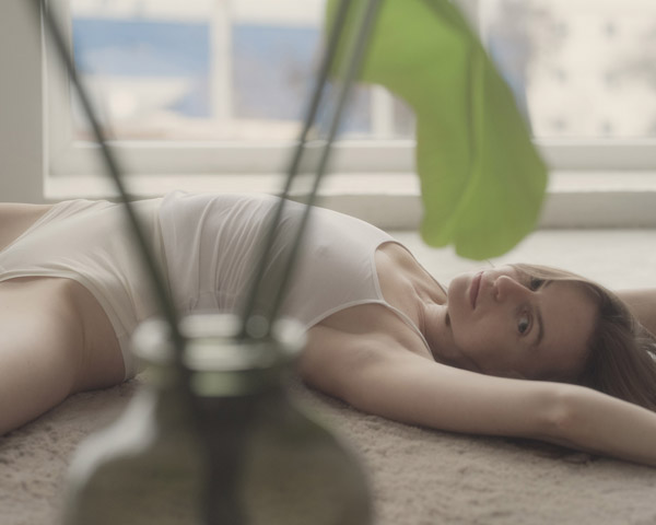
Feature showcase – Alina by thomasandp in ANDP Portra 160
This late November finds us in Kyiv, Ukraine. For those who don’t know my backstory, I used to live here…

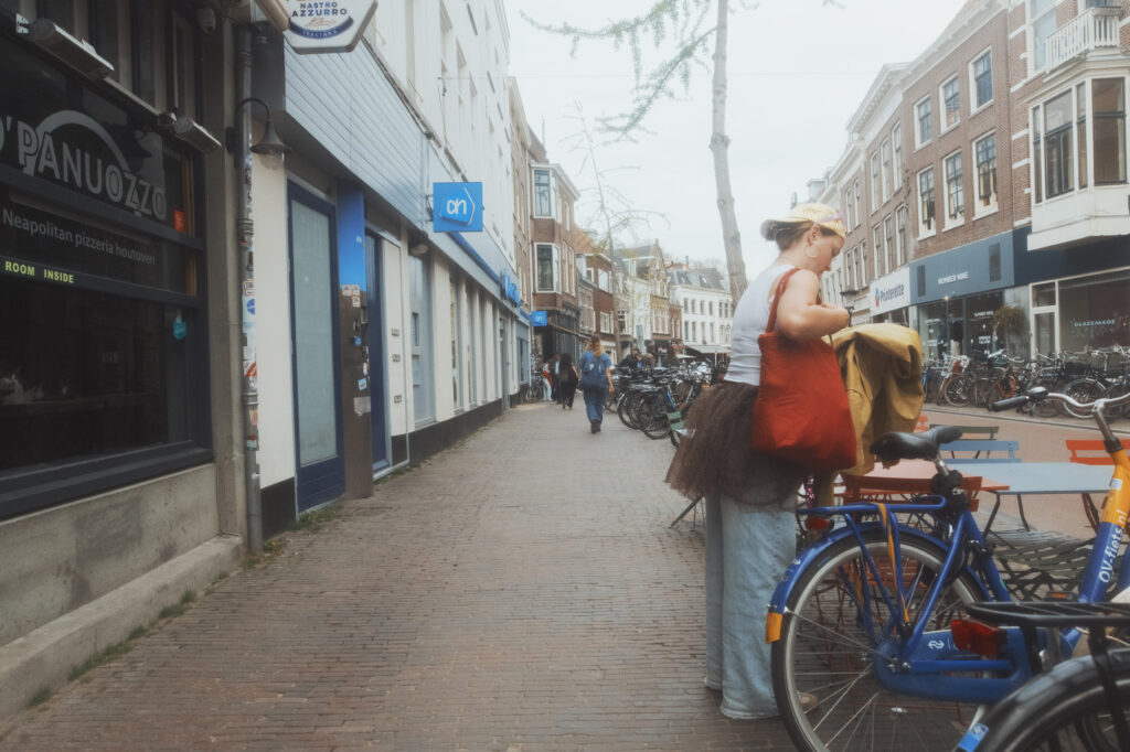
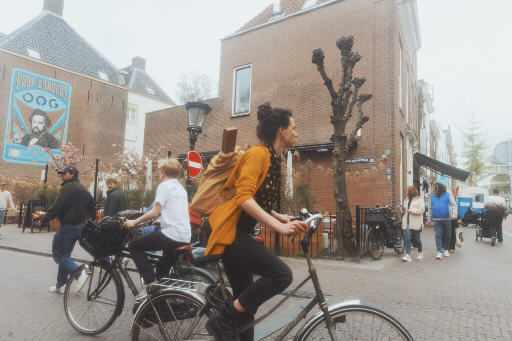
ANDP Ektachrome E100 in the streets of Utrecht — a kit test that turned into a color exercise with a DIY mist filter and an overcast afternoon.
That morning I went over to Lars’ freshly painted house to make some 360 images. Sunny day, so I hopped on the bike and went downtown to Wittevrouwensingel. After we were done we decided to go and grab lunch from Voorstraat. After we ate and while sitting there I decided it was a nice corner to capture some images. Quickly though, the sky turned overcast.


The kit I used was my Nikon Z7II with the 24mm 1.4 Sigma Art lens. In front of the lens, a Tiffen CPL and a DIY mist filter.
The CPL was left on from the morning — the day started sunny and by the time the sky turned overcast I kept it on mostly to clean up dirty reflections off windows.
A DIY mist filter is a cheap UV filter that I bought and coated with black spray paint. The spray paint adds a texture that catches and spreads highlight light before it even hits the front element, introducing a subtle halation and softening the clinical sharpness of modern lenses. The effect is optical rather than digital, which means it’s baked into the raw file and interacts naturally with whatever simulation you apply on top.
Things quickly started to unfold as there is a lot of character in the cute little streets of Utrecht and honestly it was just a short walk, so I didn’t have the luxury of making hundreds of photos. It was mostly a kit test at this point and my primary focus was color rather than moment or composition. The camera was held in front of me on my chest, and shots were taken when something was close enough to be regarded as a “composition”.
The 24mm is a difficult lens for this because the distance has to be closed in and there is going to be a lot of environment in the image, for better or for worse. Most of the shots felt empty, and the ones where subjects were indeed close enough were limited.

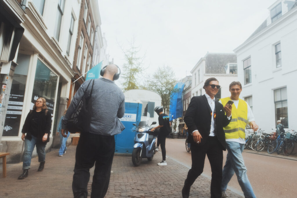
After we were done with lunch we got up and went a little further down Voorstraat for Lars to buy some toothpicks. We just walked there while I wasn’t shooting, just observing the environment and colors. There is definitely the deep brick color of the buildings, grey and reddish street, overcast sky that would just get blown out — so mostly a neutral, warmish, bright palette. My main concern was to find the “accent” colors and what could actually stand out as a real composition focused around color.
Blue and light blue was definitely on the menu, because it is used very often in all sorts of random situations — mostly commercial and whatnot — which gave me the idea to combine it with anything from the green-yellow band all the way to the red-orange-yellow band. And so, that became my trigger to shoot. Looking back at the final selection, it mostly held up. The frames that work are the ones where that blue accent showed up — whether it was a sign, a bike, a jacket — against the warmer ambient tones of the street. The ones that didn’t make the cut were mostly the ones where I fired without that contrast being there.

After 20 minutes I was done and we were heading back home. Lars let me borrow an Olympus OM-2 as a thank you for helping him with the 360 photos of his house, so I also stopped into Fotowereld and loaded it with a Kodak Ultramax 400 to continue my reference buildup. The Ultramax roll is still being shot — that will be its own post.
When I got back I loaded the images into Camera Raw and made a quick selection of the most color-worthy shots. Compositions are okay, so-so — I’m not much of a street photographer and I know it, but I am a person that knows color when they see it. And so that was what my eyes were looking for.
Tried out several of the existing simulations and I definitely needed a warm one, to bring out the subtle warmth of the brick and other deep brown tones. I found Ektachrome E100 to be the most balanced choice. Other candidates were Kodachrome 64, which would need a midtone boost, and Kodak Vision3 250D, which would have worked better if the sky wasn’t overcast — it handles those blue tones better. The Ektachrome E100 seemed to handle the nuances of those particular conditions better and I didn’t want to do much more regarding editing.
What the Ektachrome E100 does specifically to this kind of material is keep the brick tones present without pushing them into orange — there’s a warmth there but it stays grounded. And on the overcast side, it doesn’t try to compensate. The sky stays bright and neutral, the shadows stay clean, and nothing feels like it’s been corrected. It just looks like that’s how the light was, which is exactly what you want from a simulation.
This late November finds us in Kyiv, Ukraine. For those who don’t know my backstory, I used to live here…